Desktop & Mobile menu using (jdoc attribs, module template and layout override)
In this article, we will learn: How to create Desktop & Mobile menu using (jdoc attribs, module template and layout override) in Joomla 5.
Before diving into the tutorial, let’s take a moment to understand the key components we’ll be working with:
- JDoc Attribs: These are attributes that allow you to add additional properties to your Joomla module and component outputs. They give you more control over the HTML structure and styling.
- Module Templates: Joomla allows you to create custom templates for different modules. These templates determine the HTML structure and CSS for modules like menus, making them essential when customizing menu designs.
- Layout Overrides: Joomla’s layout overrides provide a way to change the default HTML output of a module or component without affecting core files. This is crucial for maintaining the upgradability of your Joomla site.
Then consider following steps to make desktop & mobile menu.
Step 1:
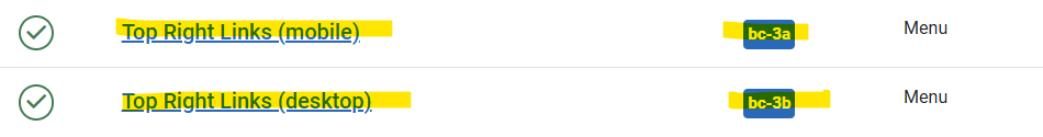
Create two menu type module from administrator like that and assign them two different positions as you can see in below image bc-3a & bc-3b are two positions in template.
Step 2:
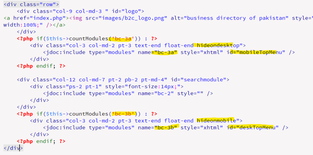
Inside your template main index.php file. Consider following code: First we have countmodule method, which will show both module at once. Next we have two css classes which will hide module on desktop & mobile respectively.
Next first we will show bc-3a position and pass id mobileTopMenu(an id to be used for JavaScript function to work correctly and avoid confliction). Then we will show module positioned at bc-3b and pass id "deskTopMenu".
Step 3:
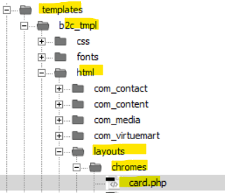
Create style layout override for that module
}
Here is code for card.php
<?php
/**
 * @package     Joomla.Site
 * @subpackage  Templates.cassiopeia
 *
 * @copyright   (C) 2020 Open Source Matters, Inc. <https://www.joomla.org>
 * @license     GNU General Public License version 2 or later; see LICENSE.txt
 */

defined('_JEXEC') or die;

use Joomla\Utilities\ArrayHelper;

$module  = $displayData['module'];
$params  = $displayData['params'];
$attribs = $displayData['attribs'];

if ($module->content === null || $module->content === '') {
    return;
}

$moduleTag              = $params->get('module_tag', 'div');
$moduleAttribs          = [];
$moduleAttribs['class'] = $module->position . ' card ' . htmlspecialchars($params->get('moduleclass_sfx', ''), ENT_QUOTES, 'UTF-8');
$headerTag              = htmlspecialchars($params->get('header_tag', 'h3'), ENT_QUOTES, 'UTF-8');
$headerClass            = htmlspecialchars($params->get('header_class', ''), ENT_QUOTES, 'UTF-8');
$headerAttribs          = [];
$headerAttribs['class'] = $headerClass;

// Only output a header class if it is not card-title
if ($headerClass !== 'card-title') :
    $headerAttribs['class'] = 'card-header ' . $headerClass;
endif;

// Add class from attributes if any
if (!empty($attribs['class'])) {
    $moduleAttribs['class'] .= ' ' . htmlspecialchars($attribs['class'], ENT_QUOTES, 'UTF-8');
}

// Only add aria if the moduleTag is not a div
if ($moduleTag !== 'div') {
    if ($module->showtitle) :
        $moduleAttribs['aria-labelledby'] = 'mod-' . $module->id;
        $headerAttribs['id']              = 'mod-' . $module->id;
    else :
        $moduleAttribs['aria-label'] = $module->title;
    endif;
}
?>
<script>
/* Toggle between showing and hiding the navigation menu links when the user clicks on the hamburger menu / bar icon */
function mobileTopMenu_<?=$attribs['id']?>(id) {

  var x = document.getElementById(id);
  if (x.style.display === "block") {
    x.style.display = "none";
  } else {
    x.style.display = "block";
	x.style.position="absolute";
    x.style.background="#FFFFFF";
    x.style.right="10px";
    x.style.width="250px";
    x.style.border="1px solid #EEE";
    x.style.borderRadius="15px";
	x.style.zIndex="9998";
  }
}
</script>
<div class="topnav_<?=$attribs['id']?> <?php //echo $class_sfx; ?>">
  <a href="#home" class="active"></a>
  <!-- Navigation links (hidden by default) -->
  <div id="<?=$attribs['id']?>">
  <?php echo $module->content; ?>
  </div>
  <a href="javascript:void(0);" class="icon" onclick="mobileTopMenu_<?=$attribs['id']?>('<?=$attribs['id']?>')">
    <i class="fa fa-bars"></i>
  </a>
</div>

<style>
/*********
MENU
*****************/
/* Style the navigation menu */
.topnav_<?=$attribs['id']?> {
  position: relative;
}

/* Hide the links inside the navigation menu (except for logo/home) */
.topnav_<?=$attribs['id']?> #<?=$attribs['id']?> {
  display: none;
}

/* Style navigation menu links */
.topnav_<?=$attribs['id']?> a {
	color: green;
	padding: 10px 12px;
	text-decoration: none;
	font-size: 17px;
	display: block;
	margin: 7px;
}

/* Style the hamburger menu */
.topnav_<?=$attribs['id']?> a.icon {
	background: #FFFFFF;
	border:1px solid green;
	border-radius:50%;
	display: block;
	position: absolute;
	right: 0;
	top: 0;
	z-index: 9999;
}

/* Add a grey background color on mouse-over */
.topnav_<?=$attribs['id']?> a:hover {
  background-color: #FFF;
  color: black;
}
.metismenu.mod-menu .metismenu-item{
	padding: 1em 1em 1em .25em  !important;
}
/* MOBILE */
@media (max-width:569px) {
.metismenu.mod-menu .metismenu-item {
    padding: 5px 0 !important;
    display: block;
    font-size: 1rem;
}
.topnav_<?=$attribs['id']?>
{
	display:block;
}
.headerwrapper div.container {
	border-radius: 25px;
}
.container-header nav
{
	display:contents;
}
}
</style>
Get Custom joomla Template Development Services
Also check this : Desktop & Mobile menu in HTML CSS on www.abdulwaheed.pk
Hope this helped.
Still need help! no problem, feel free to contact us Today